Someone suggested having computer generated type conveying the message but then try illustrating the cookie. I am going to try this and if it works then Ill stick with that but if it doesnt I am just going to stick with what I started with...
 I thought that maybe adding a cookie behind the type would help create a clearer concept but the poster is still not working properly.
 Trying to make the type into a shape of a cookie, this has ended up being hard to read and looses concept.
 Below are a range of type experiments that I have played with to try and create a good composition for my poster. I think I am trying too hard here and I have been looking at it for far too long, I think I need to step back and simplify.
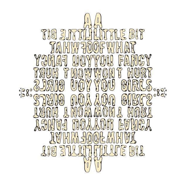

 I started experimenting with the type by reflecting it but I think this just confuses the whole design.
 This below is hand drawn type I have created to maybe place onto my poster, I wanted the type to be more fun and vibrant and I thought that maybe making it out of cookies would add some excitement to the poster.
 Below I have placed the hand drawn type into context of the poster, I think it looks fun and exciting but i think there is too many aspects of the poster competing with one another as there is hand drawn type, photography and digital type.
I also thought about maybe experimenting with the type Bebas a little bit to make it slightly more individual as bebas seems to be using a lot, im not sure if this looks appropriate enough yet though.

No comments:
Post a Comment