This is another idea that I thought i could create soley out of hand drawn type, the reason for this being that it is more bubbly and curvy and excentuates the idea that women should love their curves.


From the feedback in the crit it became apparent that although the idea looked good the whole meaning and concept behind it wasnt really strong enough, i decided to work back into the idea and try and play with the shape of the temple, for instance making the sides of the temple look like the curves of a woman to try and add more meaning and understanding to the idea.


This idea below was a quick concept i sketched that would maybe add a different twist to the design , adding a humour element to it by displaying boobs to look like the tops of the temple but i dont really think this is appropriate enough really.

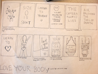
After sketching initial ideas i went straight on to designing this temple made out of type! the message i am trying to get across here is bascially that women should love their bodies and that their bodies are temples. Although i understand this concept it may not be as clear to others and so i think i am going to take this further and maybe experiment with creating more feminist objects out of type to really convey message clearly.

Initial sketch that I decided to develop...based around the concept that your body is a temple and using type as image to portray this.
 Powerful wording could work really well with this campaign, I think I just need to have fun with it and make women realllly BELIEVE what I am saying.


 Powerful wording could work really well with this campaign, I think I just need to have fun with it and make women realllly BELIEVE what I am saying.


 I have live traced my drawing to give me more clear and precise lines which will look a lot more professional and clean.
 I then began to add appropriate colour relating to skin tones...emphasising loving your body.


 This idea below was a quick concept i sketched that would maybe add a different twist to the design , adding a humour element to it by displaying boobs to look like the tops of the temple but i dont really think this is appropriate enough really.

